Styling the Form
Now that we have a working Contact Us form, covered by automated tests, it is time to make it more visually appealing and user-friendly. For this, we’ll use the Common Styling module.
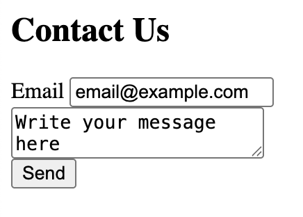
Without Common Styling |
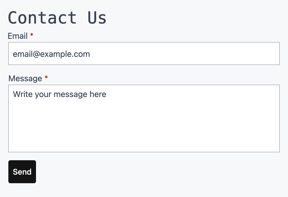
With Common Styling |
Introduction to the Common Styling Module
The Common Styling module provides a reusable design system for platformOS to make your projects look great out of the box and gives you simple tools to customize them.
Why use it?
- The key reason is consistency: Common Styling is used in all of our open source platformOS modules, such as
pos-module-chat,pos-module-user, and others. If you use Common Styling in your project and configure it with your branding, all endpoints provided by these modules will immediately inherit it and look consistent with your own endpoints. - Your pages instantly look clean, modern, and user-friendly without extra effort.
- Another benefit is easy customization. You can override styles using simple CSS variables to adapt the defaults to your project’s branding.
Under the hood, the module comes with reusable CSS and JavaScript. You can use these styles directly in your project, or rely on them indirectly through other platformOS modules. The goal is to provide a unified design system for modules, while allowing you to override or extend the defaults whenever your project requires it. Let's get started!
In the next steps, we’ll:
- Install the module into our Contact Us project.
- Explore its built-in style guide.
- Activate it through a layout.
- Apply Common Styling to our Contact Us form.
- Learn how to customize it with CSS.
Tip
You can check out the final code for this step by using the checkpoint-common-styling tag in the tutorials-contact-us repository.
Run the following commands to view the code as it appears at the end of this chapter:
git checkout tags/checkpoint-common-styling
git checkout main Installing the Module
Before we can use Common Styling, we need to add it to our Contact Us project. Let’s go step by step.
Navigate to your project root directory:
cd contact-us
Install the Common Styling module:
pos-cli modules install common-styling
This command updates the pos-module.json file with a reference to the installed module and automatically downloads the module’s source code and all its dependencies into your local environment, so you can explore its assets and see how components are implemented.
Finally, deploy your changes to your staging instance so you can start using the module:
pos-cli deploy staging
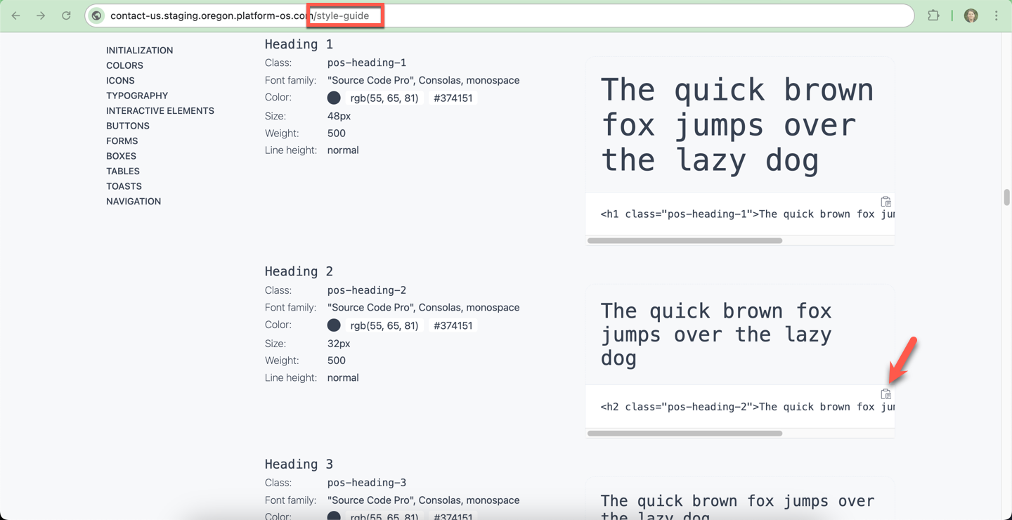
Explore the Built-in Style-Guide
Once the Common Styling module is installed and deployed, your instance automatically comes with a built-in style guide.
This is a special page that demonstrates all the components, layouts, and variables available to you, including:
- Headings and typography – consistent text styles for your app
- Buttons – different types, sizes, and states
- Forms – ready-to-use layouts and error messages
- Tables, tags, cards, pagination, toasts – and more
In your browser, add /style-guide to your instance URL to access the page.
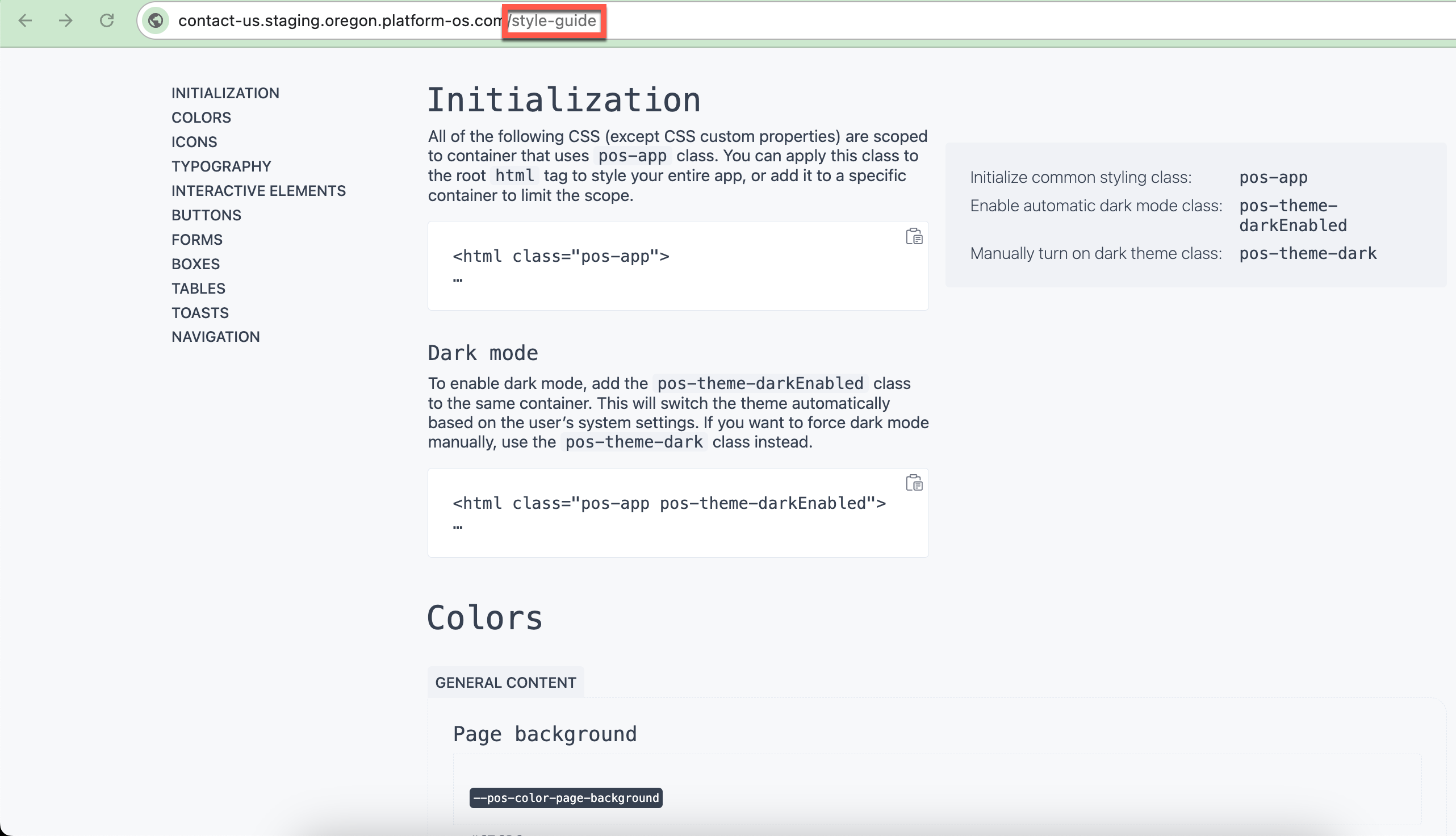
Each example shows both the visual result and the code snippet you can copy into your project.
We’ll use this style guide as our reference manual while enhancing the Contact Us form.
Think of it as your “palette” — it shows all the building blocks available, so you can decide which ones to apply and how.
The style guide also lists all available CSS variables.
These variables control colors, spacing, typography, and more. Later, you can override them in your own stylesheet to customize the look and feel of your application without touching the module code.
Activating Common Styling
Now that the Common Styling module is installed, we need to activate it so that its design system applies across our project. At the moment, our Contact Us app does not have a Layout defined, so we’ll start by creating one.
Tip
When in doubt, you can always refer to /style-guide on your instance, or to the documentation in the Common Styling repo.
Why do we need a layout?
Layouts save you from repeating the same HTML structure across multiple pages. Thanks to them, any change to the header, navigation, or footer requires updating only a single file — the Layout. This reduces duplication, eliminates inconsistencies, and prevents forgotten updates. Think of the Layout as the frame of your application: each page is displayed inside it.
They are also useful for SEO and performance: Layouts ensure that consistent meta tags, structured data, and performance optimizations are applied across all pages automatically, without having to include them manually each time.
Layouts are also the right place to load global styles and scripts. This makes them the perfect spot to include the Common Styling module so that its design system applies across your application.
Example from the Common Styling repo
The Common Styling module provides a minimal example layout.
This example shows you how to load Common Styling assets in the <head> and how to structure your layout file.
We’ll use a simplified version of it as a starting point for our Contact Us form.
Creating a Layout
Now that we understand why layouts are important, let’s create one for our Contact Us project.
Create the layouts directory (if it doesn’t exist yet) and the layout file:
mkdir -p app/views/layouts
touch app/views/layouts/application.liquid
Tip
By default, all Pages automatically use the application layout if it exists. You can change the default layout name via the default_layout setting in app/config.
Open app/views/layouts/application.liquid and paste the following code.
We’ve adapted it from the minimal example layout in the Common Styling repo, changing the title and description to match our Contact Us form project:
app/views/layouts/application.liquid
<!DOCTYPE html>
<html lang="en" class="pos-app">
  <head>
    <meta charset="utf-8">
    <meta name="description" content="Contact Us form">
    <title>Contact Us Form</title>

    {% render 'modules/common-styling/init', reset: true %}
    <link rel="stylesheet" href="{{ 'modules/common-styling/style-guide/styleguide.css' | asset_url }}" type="text/css">
    <script src="{{ 'modules/common-styling/style-guide/styleguide.js' | asset_url }}" defer></script>
    <meta name="viewport" content="width=device-width,initial-scale=1,user-scalable=yes">
  </head>
  <body>
    {{ content_for_layout }}

    {% liquid
      theme_render_rc 'modules/common-styling/toasts'
    %}
  </body>
</html>
Understand What This Layout Does
-
Global activation of Common Styling
<html lang="en" class="pos-app">Adding the
pos-appclass to your<html>tag activates the Common Styling design system globally. Every page that uses this layout will now have consistent styling. -
Loading Common Styling assets
{% render 'modules/common-styling/init', reset: true %}
This line loads the Common Styling CSS and JS into your app.The
reset: trueoption applies a CSS reset, which removes inconsistent browser defaults (like margins and paddings) so your pages look the same across Chrome, Firefox, Safari, and others. -
Style guide assets
<link rel="stylesheet" href="https://files.ps-01-platformos.com/instances/123/assets/modules/common-styling/style-guide/styleguide.css?updated=1781774260" type="text/css">
<script src="https://files.ps-01-platformos.com/instances/123/assets/modules/common-styling/style-guide/styleguide.js?updated=1781774260" defer></script>
These files are optional, but useful during development: they load the demo styles and scripts you saw in
/style-guide.
You can remove them later if you don’t need them. -
Where your page content appears
{{ content_for_layout }}
This is a placeholder. When you render a page (like your Contact Us form), its content will be inserted right here inside the layout. -
Toast notifications
{% render 'modules/common-styling/toasts' %}
This enables toast notifications — small pop-up messages like “Message sent successfully.”
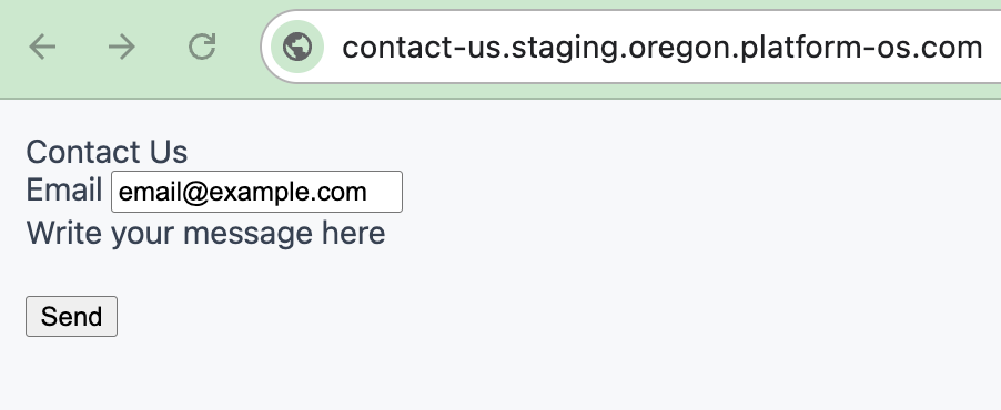
Check the results
Deploy or sync your changes, then open your Contact Us form in the browser.
You should already notice differences:
- The fonts and colors look different.
- Form fields are styled more consistently.
- The overall design feels more polished — even though we haven’t applied any specific form styles yet!
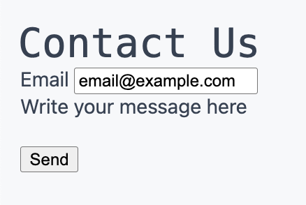
Starting Point: A Plain Form
Now that Common Styling is activated in our layout, let’s apply it to our Contact Us form.
We’ll start from the plain HTML version we have, and enhance it with Common Styling classes and components until we have a polished, consistent design.
Here’s what the form looks like right now:
app/views/partials/contacts/form.liquid
<h2>Contact Us</h2>
<form action="/contacts/create" method="post">
  <input type="hidden" name="authenticity_token" value="{{ context.authenticity_token }}">
  <div>
      <label for="email">Email</label>
      <input type="text" name="contact[email]" id="email" value="{{ contact.email }}">
      {% if contact.errors.email != blank %}
        <p>{{ contact.errors.email | join: ', ' }}</p>
      {% endif %}
  </div>
  <div>
    <textarea name="contact[body]">{{ contact.body }}</textarea>
      {% if contact.errors.body != blank %}
        <p>{{ contact.errors.body | join: ', ' }}</p>
      {% endif %}
  </div>
  <input type="submit" value="Send">
</form>
This works, but it looks plain. :) Let’s gradually improve it using Common Styling.
Styling the Heading
The first improvement we’ll make is to the form’s heading. Right now, it’s just a plain <h2>Contact Us</h2>.
Open your instance’s /style-guide#headings in the browser.
Let's start with something simple. Visit your instance’s /style-guide#headings. Here you’ll find a list of available heading levels (h1, h2, h3, etc.) along with the CSS classes you can apply to style them.
Take a moment to compare how each heading looks. This gives you a sense of the hierarchy and design consistency.
Our form uses an <h2> element, so let’s pick the matching pos-heading-2 class from the style guide.
Change:
<h2>Contact Us</h2>
To:
<h2 class="pos-heading-2">Contact Us</h2>
Save your changes, make sure you are syncing, and reload your form in the browser:
Styling the Form
With our heading styled, let’s move on to the form itself. Right now, the form works but looks plain. Visit /style-guide#forms in the browser. Here you’ll see how forms are structured, what classes are available, and how error handling works.
One of the examples looks like this:
<form action="" class="pos-form pos-form-simple">
  <fieldset>
    <label for="styleguide-form-example-a">Email</label>
    <input type="email" id="styleguide-form-example-a" placeholder="Email address" required {% render 'modules/common-styling/forms/error_input_handler', name: 'styleguide-form-example-a', errors: errors['styleguide-form-example-a'] %}>
    {% render 'modules/common-styling/forms/error_list', name: 'styleguide-example-error', errors: errors['styleguide-form-example-a'] %}
  </fieldset>
  <fieldset>
    <label for="styleguide-form-example-b">Password</label>
    <input type="password" id="styleguide-form-example-b" placeholder="••••••••" required {% render 'modules/common-styling/forms/error_input_handler', name: 'styleguide-form-example-b', errors: errors['styleguide-form-example-b'] %}>
    {% render 'modules/common-styling/forms/error_list', name: 'styleguide-example-error', errors: errors['styleguide-form-example-b'] %}
  </fieldset>
  <fieldset>
    <input type="checkbox" id="styleguide-form-example-c" required {% render 'modules/common-styling/forms/error_input_handler', name: 'styleguide-form-example-c', errors: errors['styleguide-form-example-c'] %}>
    <label for="styleguide-form-example-c">An agreement</label>
    {% render 'modules/common-styling/forms/error_list', name: 'styleguide-example-error', errors: errors['styleguide-form-example-c'] %}
  </fieldset>
</form>
This gives us a blueprint:
- The
<form>has special classes (pos-form,pos-form-simple) for layout and styling. - Each input is wrapped in a
<fieldset>. - Error handling is implemented with reusable partials (
error_input_handleranderror_list) for consistency.
We’ll now take these best practices and apply them to our own Contact Us form.
Adding Form Classes
Let’s start by upgrading our <form> element. Originally, it looked like this:
app/views/partials/contacts/form.liquid
<form action="/contacts/create" method="post">
To activate Common Styling, we add the recommended classes from the style guide:
app/views/partials/contacts/form.liquid
<form class="pos-form pos-form-simple" action="/contacts/create" method="post">
pos-formapplies global form styles.pos-form-simplegives you a clean, stacked layout for labels and inputs.
This small change already improves spacing and alignment without writing any CSS. Check it out in your browser!
Wrapping Fields in Fieldsets
Next, let’s improve the structure of our fields. In the plain form, inputs were wrapped in <div> tags:
app/views/partials/contacts/form.liquid
<div>
  <label for="email">Email</label>
  <input type="text" name="contact[email]" id="email" value="{{ contact.email }}">
</div>
The Common Styling convention is to use <fieldset> instead:
app/views/partials/contacts/form.liquid
<fieldset>
  <label for="email">Email</label>
  <input id="email" name="contact[email]" type="email" value="{{ contact.email }}" required>
  ...
</fieldset>
Why use <fieldset>?
- Accessibility –
<fieldset>is semantic HTML. It groups related form controls in a way that screen readers can understand. - Styling – Common Styling applies consistent spacing and alignment at the
<fieldset>level.
Improving Input Fields
Let’s focus on the email input. Originally, it was defined like this:
app/views/partials/contacts/form.liquid
<input type="text" name="contact[email]" id="email" value="{{ contact.email }}">
We can improve it by:
- Switching
type="text"totype="email"→ enables built-in browser validation and mobile keyboards. - Adding
required→ adds a red*next to the field, and prevents submitting an empty form. - Keeping
idandnameattributes → needed to bind labels and save values correctly.
The improved field:
app/views/partials/contacts/form.liquid
<input id="email" name="contact[email]" type="email" value="{{ contact.email }}" required>
Adding Styled Error Messages
In the plain form, validation errors were displayed as raw text inside <p> tags. The Common Styling module provides reusable partials for this:
app/views/partials/contacts/form.liquid
{% render 'modules/common-styling/forms/error_list', name: 'email', errors: contact.errors.email %}
And similarly for the body field:
app/views/partials/contacts/form.liquid
<h2 class="pos-heading-2">Contact Us</h2>

<form class="pos-form pos-form-simple" action="/contacts/create" method="post">
  <input type="hidden" name="authenticity_token" value="{{ context.authenticity_token }}">

  <fieldset>
    <label for="email">Email</label>
    <input id="email" name="contact[email]" type="email" value="{{ contact.email }}" required>
    {% render 'modules/common-styling/forms/error_list', name: 'email', errors: contact.errors.email %}
  </fieldset>

  <fieldset>
    <label for="message">Message</label>
    <textarea id="message" name="contact[body]" rows="6" required>{{ contact.body }}</textarea>
    {% render 'modules/common-styling/forms/error_list', name: 'body', errors: contact.errors.body %}
  </fieldset>

  <input type="submit" value="Send">
</form>
Styling the Submit Button
Finally, let’s improve the submit button.
Originally, it was just a plain input:
app/views/partials/contacts/form.liquid
<input type="submit" value="Send">
Common Styling provides button classes you can explore in /style-guide#buttons.
For now, replace it with:
app/views/partials/contacts/form.liquid
<button type="submit" class="pos-button pos-button-primary">Send</button>
This gives your button a consistent look with hover states and accessible contrast.
Final Form with Common Styling
After applying all these changes, here’s our finished form:
app/views/partials/contacts/form.liquid
<h2 class="pos-heading-2">Contact Us</h2>

<form class="pos-form pos-form-simple" action="/contacts/create" method="post">
  <input type="hidden" name="authenticity_token" value="{{ context.authenticity_token }}">

  <fieldset>
    <label for="email">Email</label>
    <input id="email" name="contact[email]" type="email" value="{{ contact.email }}" required>
    {% render 'modules/common-styling/forms/error_list', name: 'email', errors: contact.errors.email %}
  </fieldset>

  <fieldset>
    <label for="message">Message</label>
    <textarea id="message" name="contact[body]" rows="6" required>{{ contact.body }}</textarea>
    {% render 'modules/common-styling/forms/error_list', name: 'body', errors: contact.errors.body %}
  </fieldset>

  <fieldset>
    <button type="submit" class="pos-button pos-button-primary">Send</button>
  </fieldset>
</form>
Now check your result in the app - you should see a styled form that already feels much closer to production quality.
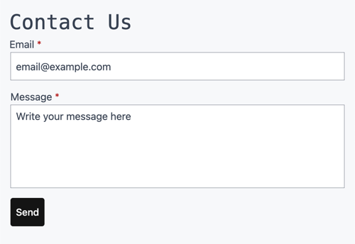
Summary
We started with a plain form and, by following the style guide step by step, we:
- Applied Common Styling form classes
- Wrapped fields in
<fieldset>for semantics and spacing - Improved input types and validation
- Replaced plain error messages with styled components
- Added a professional-looking button
The result is a form that is responsive, accessible, and visually aligned with the rest of your platformOS application — without writing a single line of custom CSS.
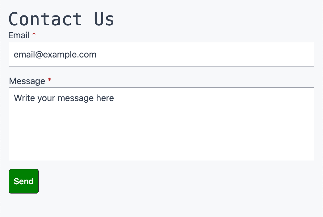
Customizing the Look with CSS
One of the biggest advantages of the Common Styling module is that you don’t need to edit the module itself to change the look and feel.
Instead, you can override its CSS variables in your own stylesheet. This keeps your project clean and makes upgrades easier.
Let’s walk through a simple example: changing the primary button from its default black to a green theme.
Create a Custom Stylesheet
First, create a file to store your overrides.
A good convention is to call it variables.css and place it in the app/assets directory:
app/assets/variables.css
:root {
  --pos-color-button-primary-background: #008000;
  --pos-color-button-primary-hover-background: #00a000;
}
Here we define two variables for this scenario:
--pos-color-button-primary-background→ the normal background color--pos-color-button-primary-hover-background→ the hover state
In our example, the primary button will be green, and slightly lighter on hover.
Load Your Stylesheet in the Layout
To make sure your overrides take effect, load your custom stylesheet after the Common Styling init partial in your layout.
This ensures your styles “win” over the defaults.
Tip
Always load your overrides after common-styling/init. This ensures your custom values take precedence.
Open your layout file:
app/views/layouts/application.liquid
Find this line:
{% render 'modules/common-styling/init', reset: true %}
And add your stylesheet right below it:
{% render 'modules/common-styling/init', reset: true %}
<link rel="stylesheet" href="{{ 'variables.css' | asset_url }}">
<meta name="viewport" content="width=device-width,initial-scale=1,user-scalable=yes">
app/views/layouts/application.liquid
Deploy and Test
Save your changes and deploy (or sync) to your instance as usual.
Then reload your Contact Us form in the browser.
Your Send button should now appear in green, with a lighter shade when hovered.
Congratulations on completing the Contact Us form tutorial! You have learned how to use platformOS to build a functional contact form, covering various concepts such as Commands/Business logic, Validators, Events, data display, logging, testing, and using common styling.