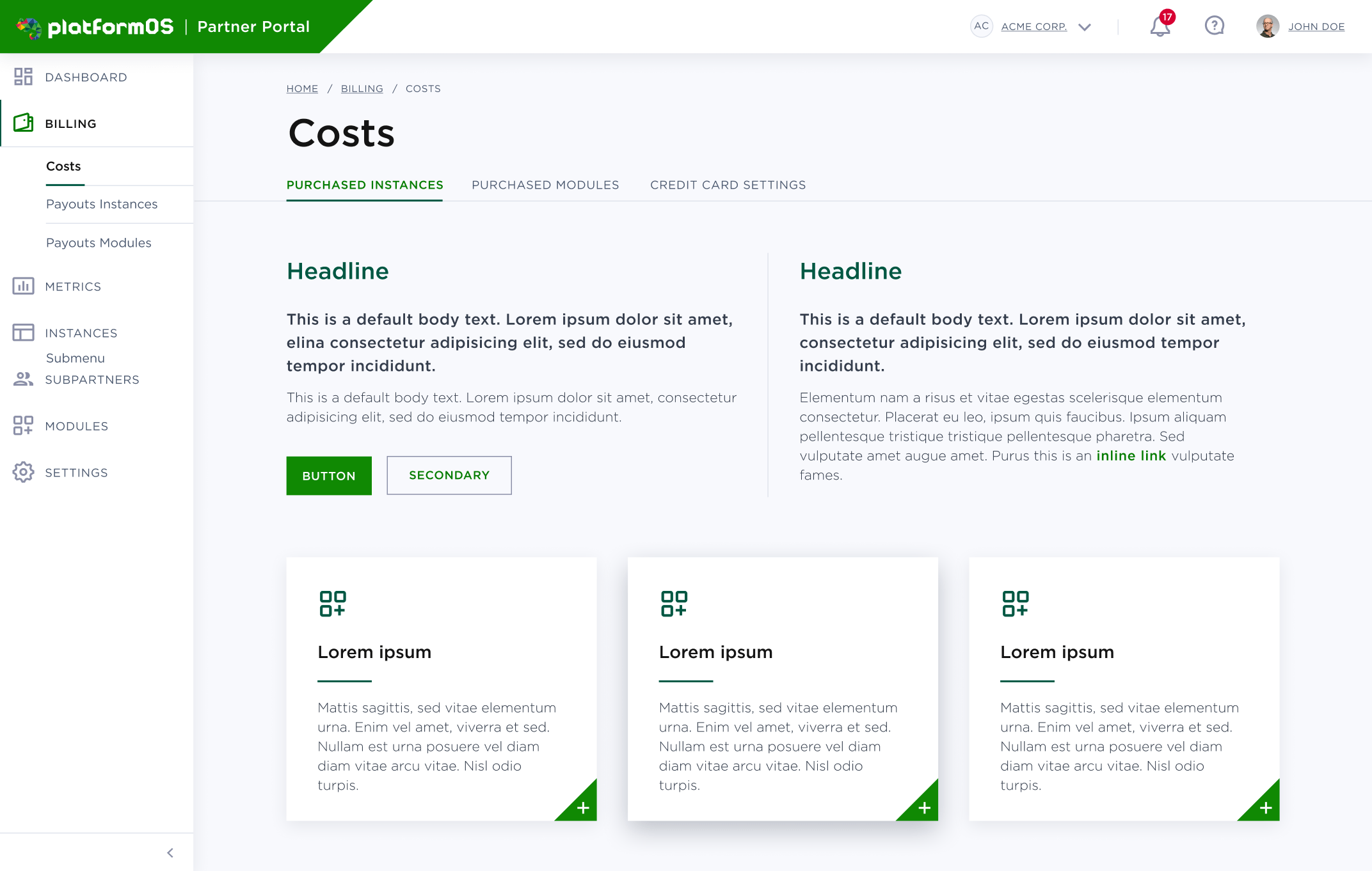
FINISHED Partner Portal Design Style
Date
August 2019
Goal
We are working on the Partner Portal redesign, and the goal of this research was to identify the preferences of the target audience related to different design versions.
Method
We used Five Second Testing that allows us to measure how well a design performs in communicating a message quickly. This kind of test provides both quantitative and qualitative feedback that helps us optimize a design. We showed each image to a participant for just five seconds, after which the participant answered questions based on their memory and impression of the design.
Results
Based on the results, the light green-white design version performed better, and the difference was statistically significant. The main reasons were that users found it cleaner, simpler, and lighter than the other version. They found this version could work better for other areas of the site like the Module Marketplace.
