The platformOS DesignKit
This article introduces the content of our DesignKit in Figma and describes the methodology of how we built and organized it. It gives you a better understanding of how it works, and where you can find the information you need.
Foundations
We use the term ‘DesignKit' for the whole design file. Its content is separated into different groups based on the level of complexity. For the Foundations part, you can find the Style Guide and the Component Library.
The Style Guide sets the most elementary part of the whole system: it contains the colors, the typography, and the design tokens. The Component Library uses these styles as defined in the Style guide. Components are organized by the Atomic Design methodology. Sections and Modules use components, and Page templates use Sections and Modules, but they aren't part of the first public version.
Besides Style Guide and Component Library, we’ve collated useful information for the Getting Started and Rules pages. These are also part of the Foundations section.
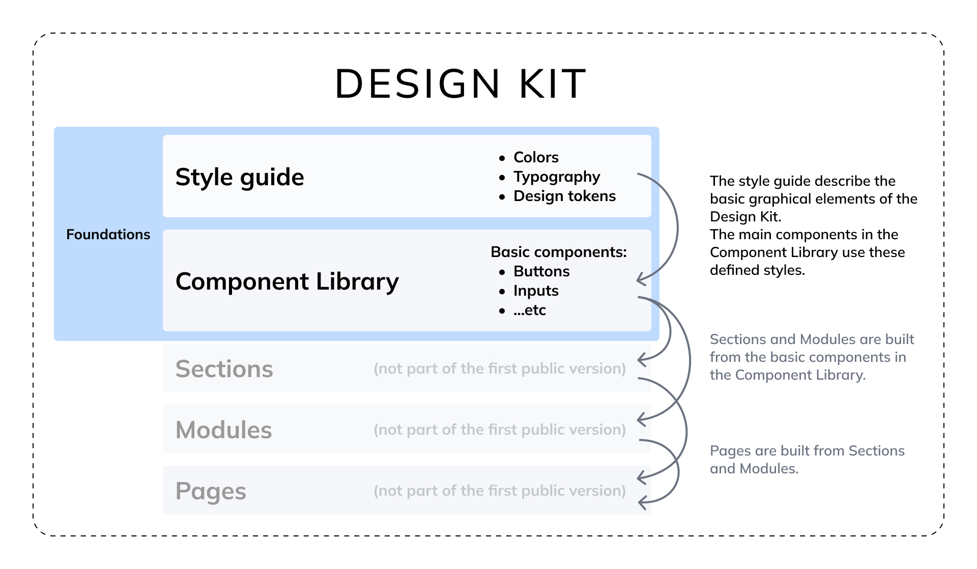
Image: Graphic explaining the key elements of the DesignKit
Cover
The Cover contains the name of the DesignKit and its current version number.
Getting Started
In the Getting Started page we highlight all the information you need to start your work.
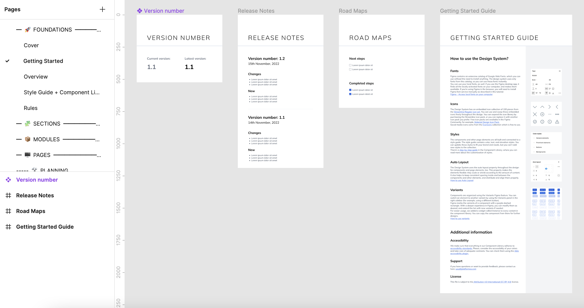
Image: The view of the Getting Started page
Version Number
This screen always shows the current version number of the design file. By checking this screen you always know whether you have the newest version of the file or not.
Road Maps
At Road Maps you can find what enhancements and fixes are planned for the future, highlighting what tasks have already been done. For more detailed information about the content of the new versions, please, go to the Release Notes in our documentation site.
Getting Started Guide
In the Getting Started Guide screen you can get the basic information about the DesignKit:
- How the font library works
- How the icon library works
- General information about the styles we used in the DesignKit
- What the auto layout and variants features are
- …and information about accessibility standards, support and licensing.
Overview
The Overview is a table of content page, where you can navigate through quick link cards to the different parts of the DesignKit.
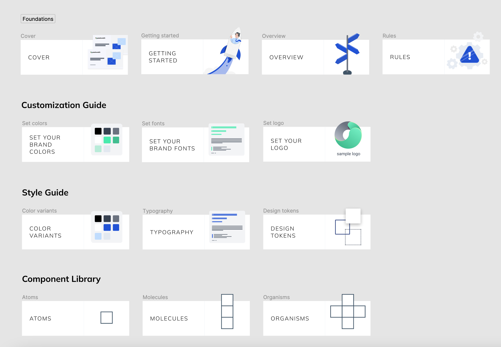
Image: The view of the Overview page
Rules
In the Rules page we collected all the information you need when you build a new screen from scratch:
- Padding sizes and usage throughout a screen: how the different sections relate to each other.
- Spacing between grouped components: relationships between buttons, tags, cards, etc.
- Pop-up sizes
- The functions of the different kinds of tabs
- Icon sizes and their usage
- UX rules about button usage, link naming, and user profiles
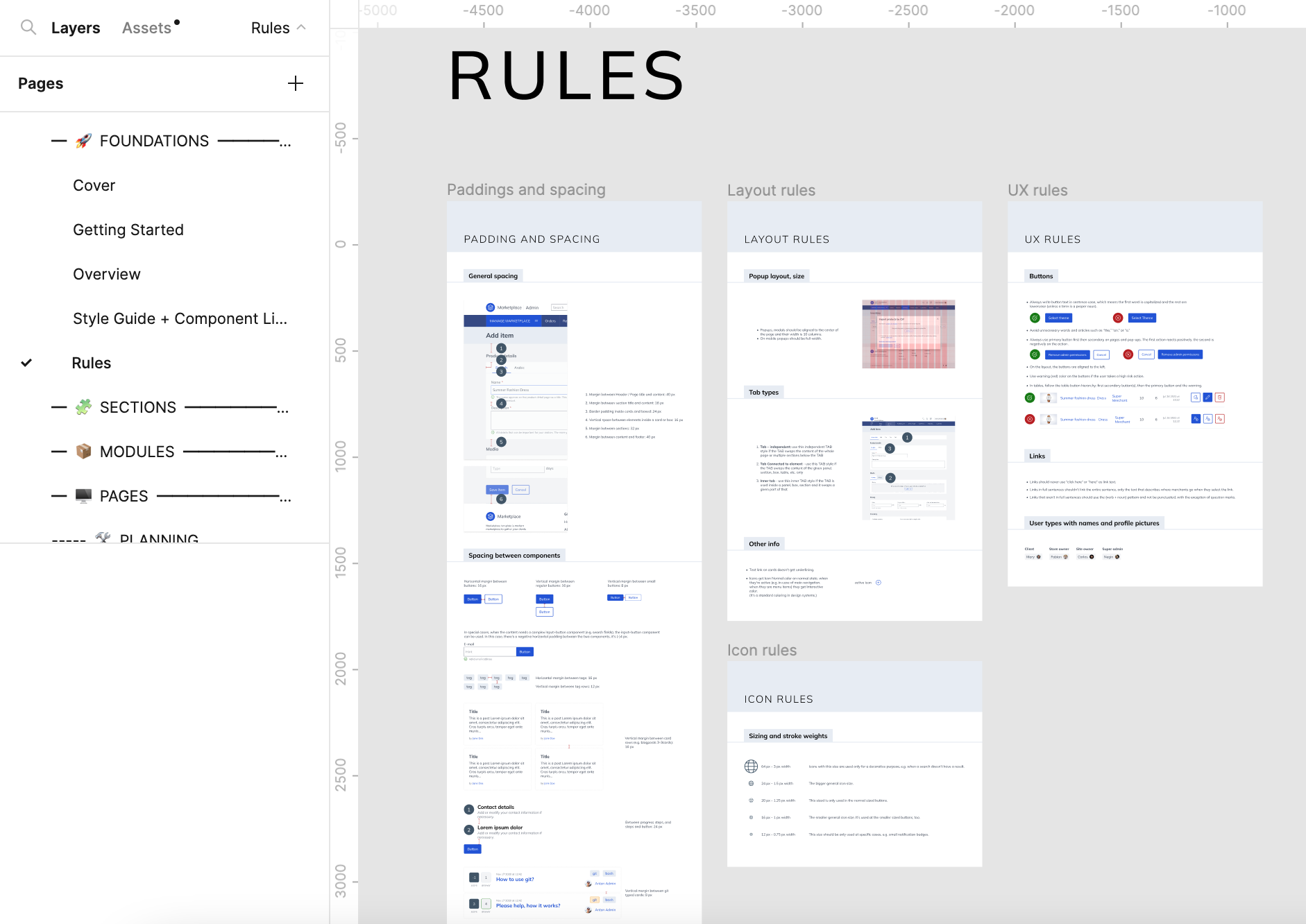
Image: The view of the Rules page
Style Guide and Component Library
This page contains the Style Guide and Component Library. Separately, provided are three step-by-step guides to help you through the standard customization flows: set your brand colors, your brand fonts, and your logo. (You can also find these articles in the documentation site, including video tutorials.)
Style Guide
In the Style Guide part, you can find the basic elements of the DesignKit: the Color variants, the Typography, and the Design tokens.
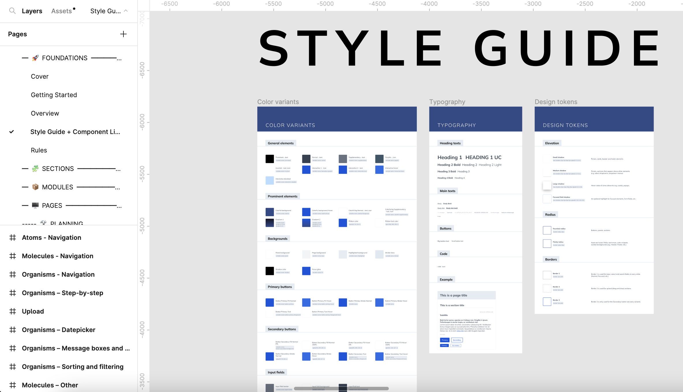
Image: The view of the Style Guide in the Style Guide+Components page
Color variants
The Color variants screen shows all the color styles you can find in the styles panel on the right. Every component and element in the DesignKit uses one or more colors from the Color variants palette. Learn more about this in the Color Variants topic.
Typography
In the Typography page, we collected all the text styles that the DesignKit uses. You can find a small example section there, too, so you can get an insight into how the different styles relate to each other and when you set your brand fonts, you can see immediately how they work.
Design Tokens
At Design Tokens, we collected all the other core properties and styles we use in the DesignKit with descriptions:
- Elevation
- Radius
- Borders
Components
In the Components section, you can see the main components that the DesignKit uses. For certain components we have used the Variants feature of Figma. For example, the DesignKit contains 216 buttons: it’s easier to use one main component, and set its specifications from a configuration panel, than to try to find the right component from 216 different versions.
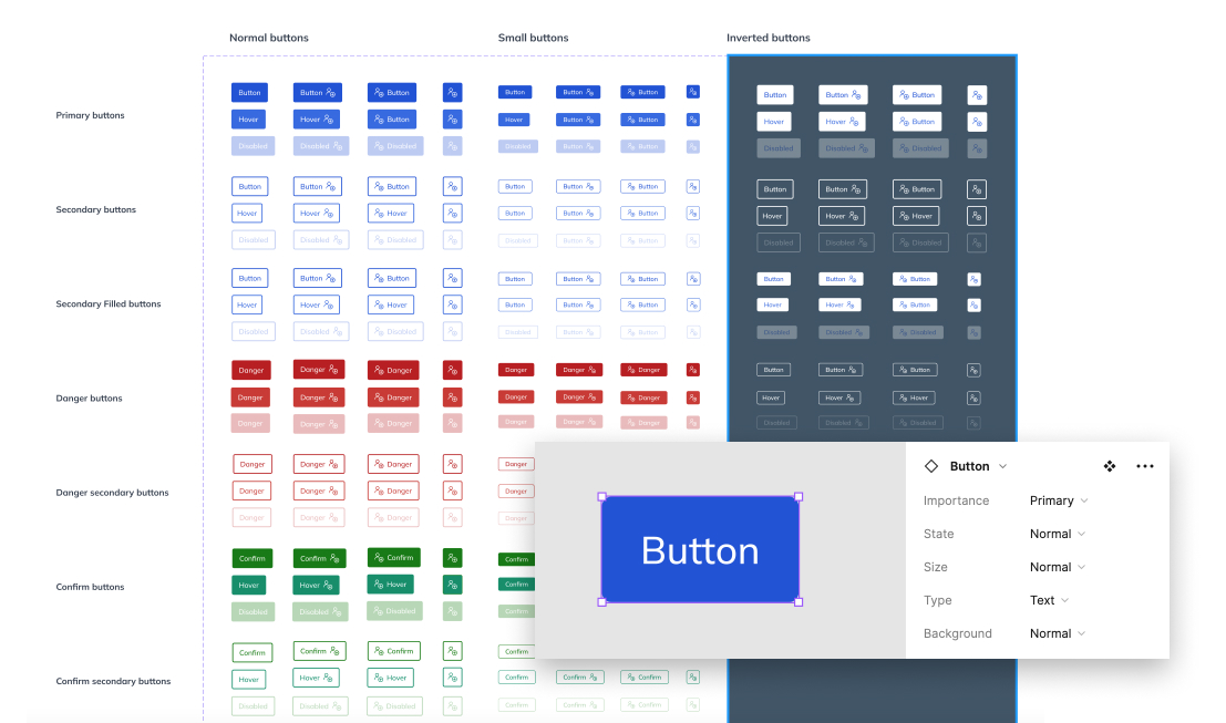
Image: The button variants and the variant panel
For easier usability, we added an Instance widget for every component that uses variants. You’ll be able to copy the instance from there, because copying from a variant section creates another main component, not an instance.
We built the Component Library based on the Atomic Design methodology, so the different groups follow this organization method and the complexity grows from top to bottom (Atoms → Molecules → Organisms).
In the first row, there are the Atoms, the most elementary components of the DesignKit. We separated them into different categories by function, to make them more scannable.
The second row contains the Molecules: the components which are built from the Atoms. We positioned the related screens below each other, for example at the Atoms – Options screen you can find the tab components, and below that there is the Molecules – Options screen which contains the full tab line built from the tab atom component.
The third row shows the most complex components: the Organisms. These components are made up of Atoms and Molecules.
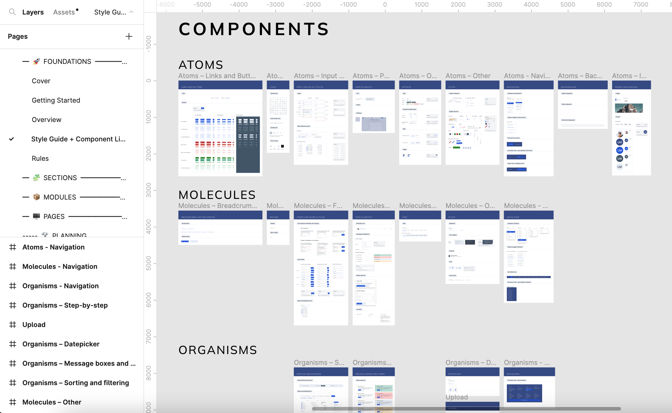
Image: The view of the Components in the Style Guide + Components page
Customization guide
In the Customization guide, you can find the three step-by-step tutorials about a standard customization flow:
- Set your brand color
- Set your brand font(s)
- Set your logo
Besides these, there is some information about the high-level customization.
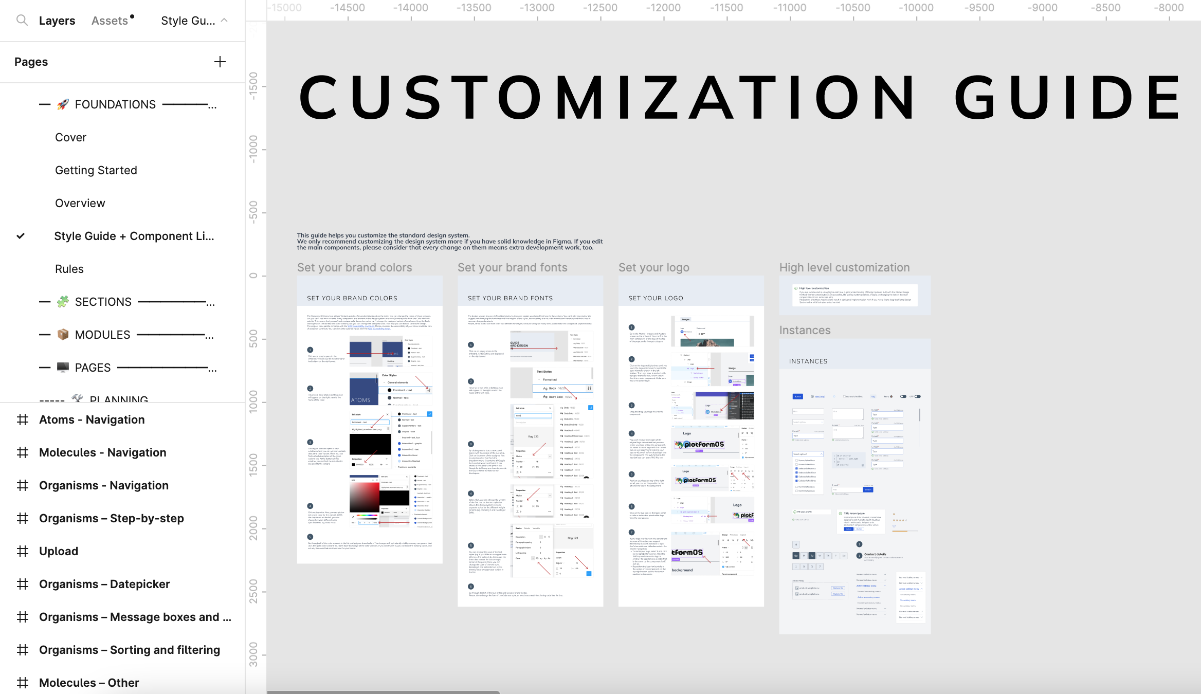
Image: The view of the Customization Guide in the Style Guide + Components page
Upcoming versions
The next versions of the DesignKit will contain more complex graphical elements: Sections and Modules. For subscribed users the full DesignKit will be available with 50+ page templates built from the Modules and Sections.
Download
Download the latest version of the platformOS DesignKit from our Figma Community profile: