Color Variants
The platformOS DesignKit uses Color Variants that are collected in the Style Guide part of the DesignKit.
The Color variants screen shows all color styles you can find in the styles panel on the right.
Every component and element in the design system uses one or more colors from the Color Variants palette.
Features
For easier usability, you can find the implemented variable name of a given color variant at the Color Variants screen.
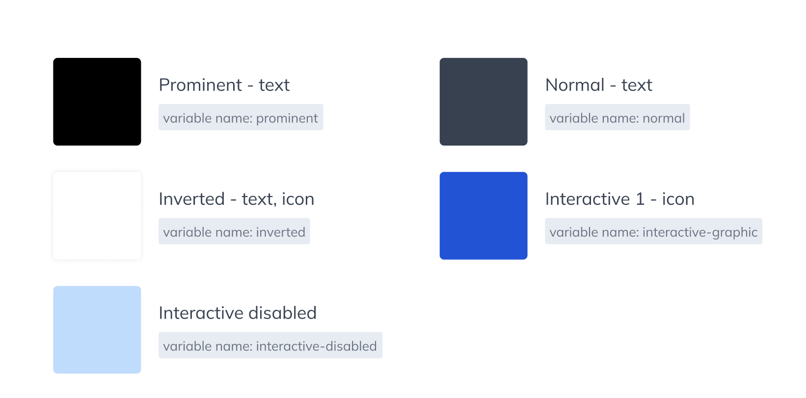
Image: Color variants with their related implemented variable names
We also added short descriptions to each color variant about its usage. You can access this information from the right sidebar panel when you move your cursor to the name of a component.
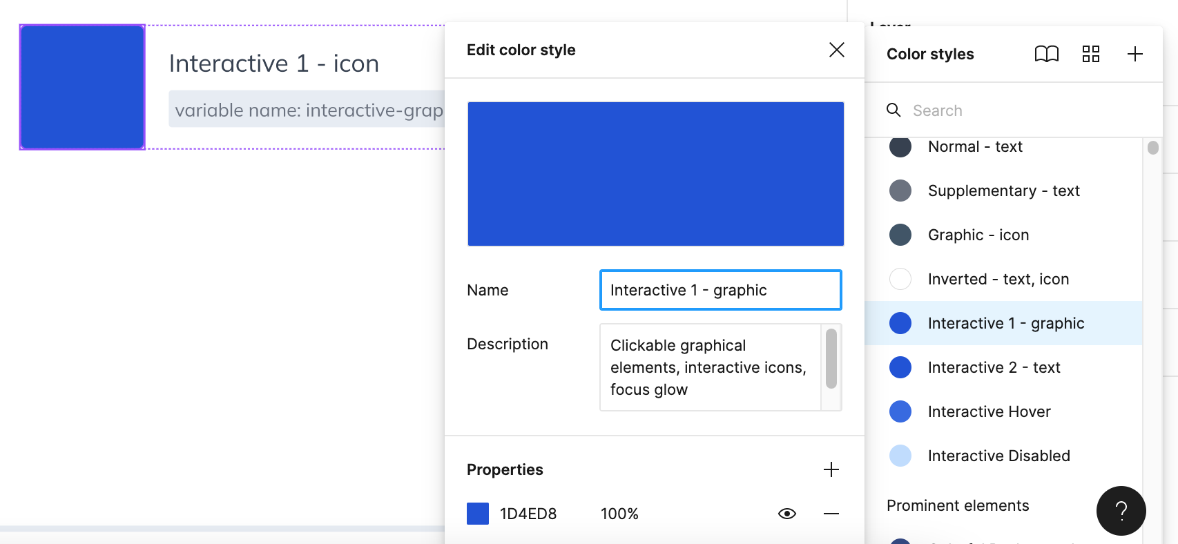
Image: Description of a color variant
Organization and description of the color variants
General elements:
We collected all the colors of the text styles here (except input field text), and differentiated them by importance.
Interactive element colors are also part of this section. We defined two different interactive colors: one for the graphical elements and one for the text elements. We separated them because of accessibility standards: for graphical elements, a smaller contrast ratio is enough compared to the texts, so you can use a lighter color for the icons. Of course, you can use the same color for both, as we did in the DesignKit. Hover and Disabled state colors are shared between the two normal Interactive Colors.
You can also find the normal Graphic – Icon color variant here, and the Inverted color which is used for texts and icons, too.
Prominent elements
At prominent elements, you can find the color variants that are applied to eye-catching elements of the site, for example, category bars, secondary dropdown menus. These colors are used to emphasize content, so we suggest using your main brand colors for these elements.
Backgrounds
At Backgrounds, you can define the colors of the surfaces throughout the whole design system. We also added the Shadow color here to provide all the information, but you have to change the shadow color manually at the Elevation styles because Figma can’t support using color styles on effect styles.
Buttons
- Primary Buttons: For Primary Buttons you have a possibility to define border color, too, we use the same color for the border and stroke in the default Design System.
- Secondary Buttons: At Secondary Buttons, you can choose to use buttons with filling or without filling.
Input fields
Here you can define all the colors of an input field: border, filling, and text.
Utility colors
These colors are used for small messages below fields, icons in input fields, and bigger message boxes for notifications in different tones. The three types of utility colors are:
- Important: for errors, emphasizing, and Danger button style
- Confirmation: for positive messages and answers, and Confirm button style
- Warning: for alerts and problems
We didn’t define a specific color for neutral messages: those types of content use the regular color variants (Normal text style, Graphic – icon style, etc.)
Accessibility
The default color palette complies with the W3C accessibility standards. Please, consider the accessibility of your colors and pay attention to using adequate contrasts. You can check the contrast ratios with the Able accessibility plugin.
Download
Download the latest version of the platformOS DesignKit from our Figma Community profile: