Features
The platformOS Component Library has great design features, which makes working with the Library efficient for UX and UI designers. It is dynamic, flexible, mobile-friendly, accessible, and the components have several swappable variants. This topic describes these features in more detail, and explains the features of the Figma tool that we used during the creation process.
Dynamic, flexible
Related Figma feature: Auto Layout
We built flexible components, dynamic layouts using Auto layout. In the platformOS Component Library every component has been built using this feature, allowing us to structure components in a way that they can automatically scale to adapt to a new size.
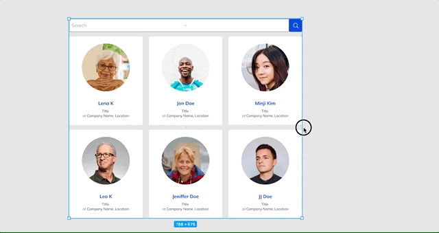
Image: Dynamic layout created with Auto layout
Components adapt to the amount of content as well. For example, a Button component stretches horizontally to make enough room for the content.

Image: Button component automatically adapts to the new content
Auto layout also helps you to keep consistent spacing inside elements, between the components, and distribute and align them properly.
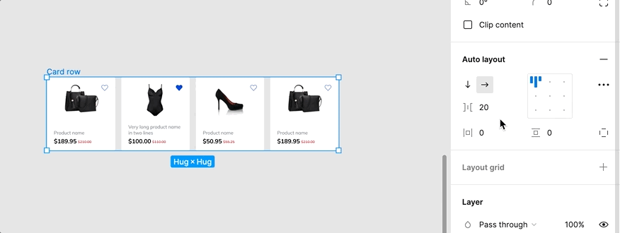
Image: Set spacing between components using Auto layout
Mobile friendly
All components are mobile-friendly in the Library and have a tappable size. So it is handy to use them on desktop (clicking on them with the mouse), or on mobile devices, tablets by tapping them as well. This means that you don’t necessarily need to create separate interface designs for these devices, the UI built from the components will be usable on all of them.
We extend the Library from time to time with elements that have a separate desktop and mobile version, providing assets for those who prefer a different look on the given devices.
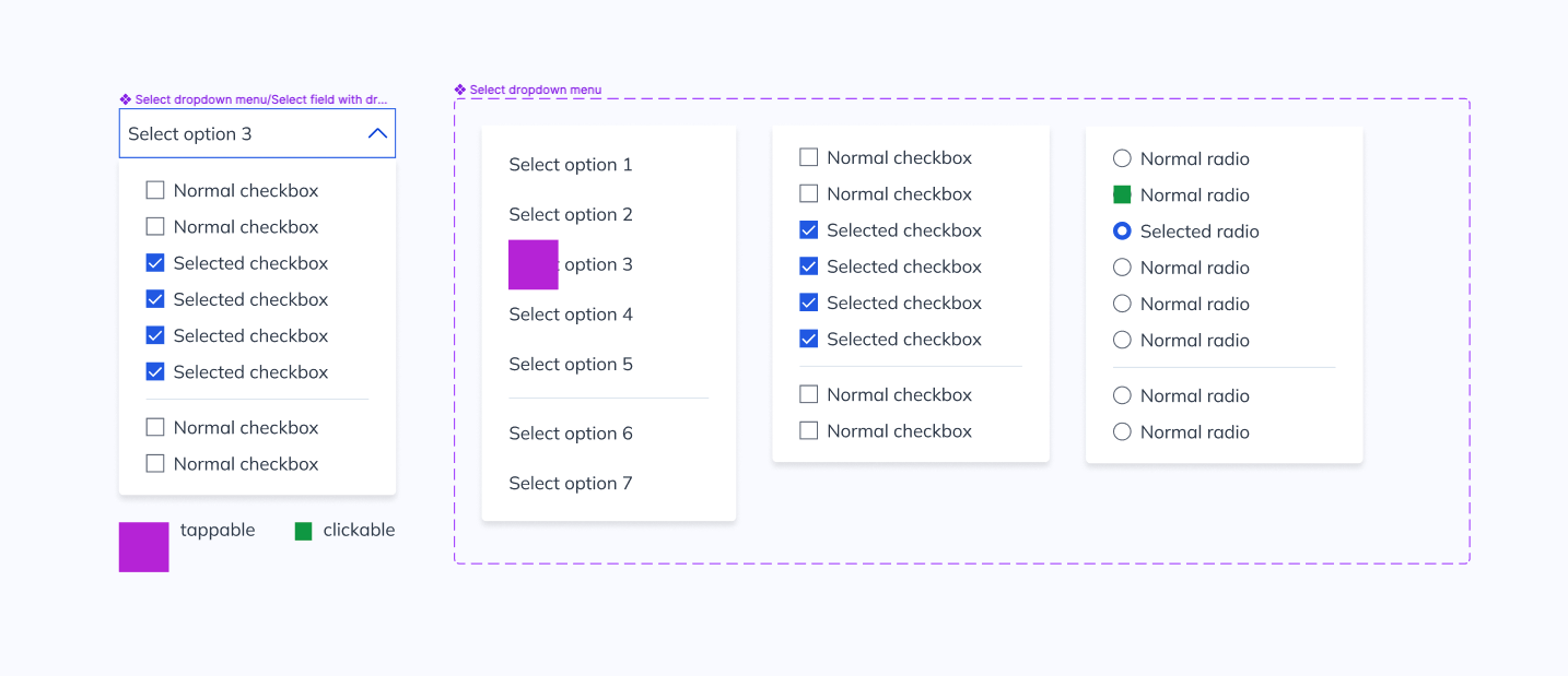
Image: Mobile friendly UI components
We keep in mind when we create components, groups, or sections that they should be responsive and be able to adapt to the screen width of the given device.
However a 4-column layout might change to 1-column on mobile as the components drop under each other due to the lack of vertical space, the components can adjust easily to the new screen-width.
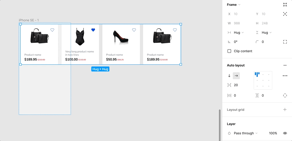
Image: Look of a Card component group on a small mobile screen
Swappable elements
Related Figma feature: Variants
Components are swappable using the Variants Figma feature. It takes just one click to replace an element in the Library with a different variant of it: e.g. buttons or form fields have normal, hover, disabled states, different types and sizes.
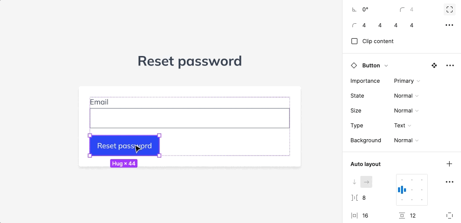
Image: Sample for swapping a Button component to another variant
Figma marks the variants of a component with a purple dashed rectangle. With a deeper experience in Figma, you can modify them as desired, and extend the list with new variants if needed.
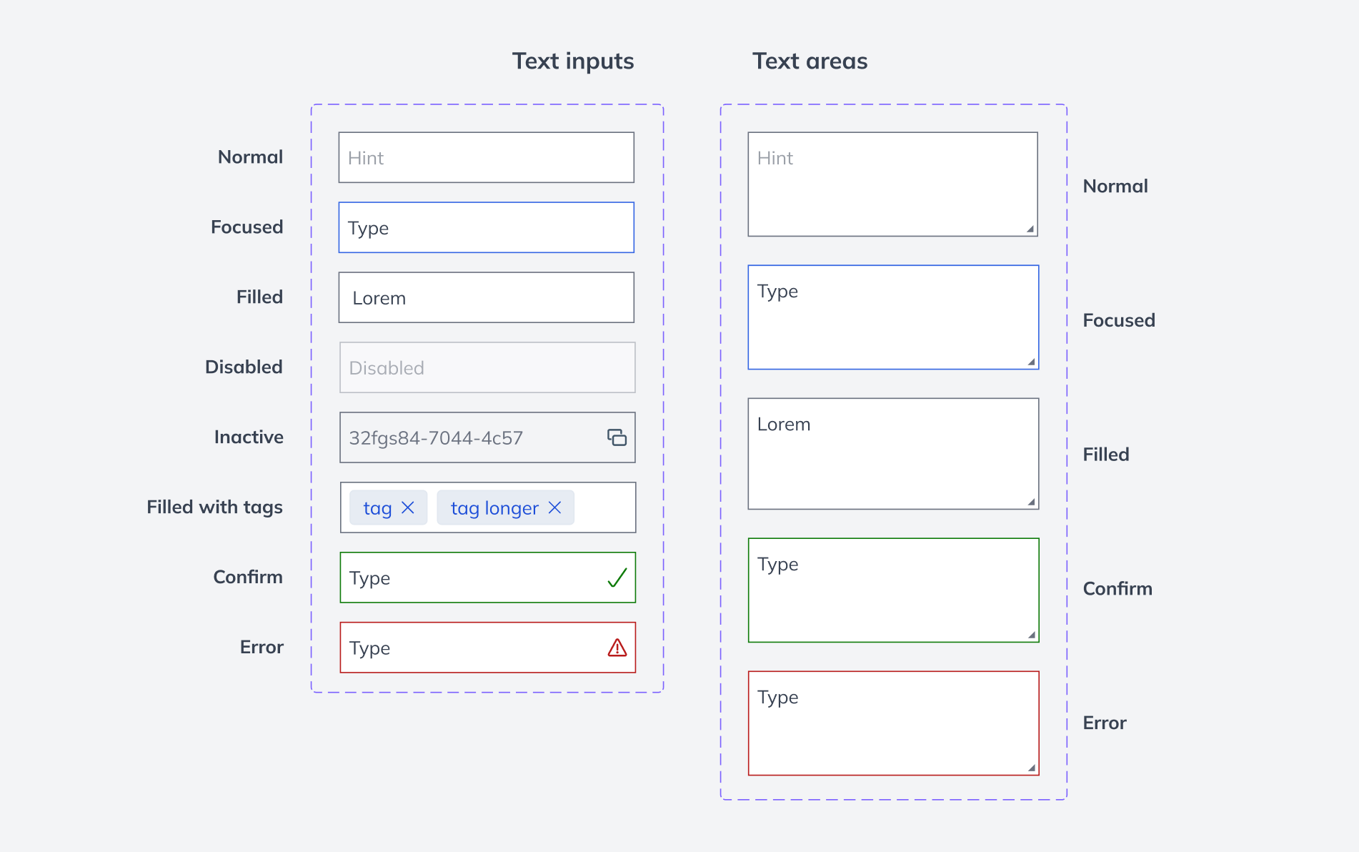
Image: Variants of a text input field and a textarea
Accessible
Figma plugin that provides it: Able
We make sure that everything in our Component Library adheres to accessibility standards using the Able Figma plugin.
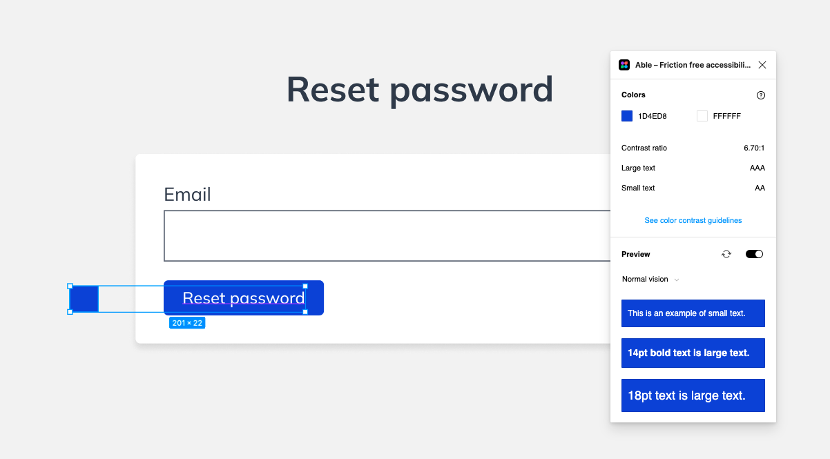
Image: Using Able, the accessibility checker plugin
To enhance the usability for all users, including those with visual impairments our components have:
- A thoughtfully selected color scheme. High-contrast colors for fonts, graphical elements, and backgrounds.
- Correct contrast-ratio between foreground elements and background, including the inverted elements, where the background has a darker color and the foreground is lighter.
- Well-chosen interaction color, that is also prominent and aesthetic despite the required high-contrast.
- Proper font sizes.
- Text styles with several different font weights and sizes, instead of using lighter and darker gray shades to provide a visual hierarchy. E.g. metadata, less important texts use a smaller, lighter font (instead of a small, light gray color).
Resources
- Figma Tool
- Able accessibility plugin
- Implemented Component Library - in development
Download
Download the latest version of the platformOS DesignKit from our Figma Community profile: