The platformOS Component Library
What is the Component Library
The platformOS Component Library is a comprehensive collection of premade user interface elements, components that you can readily use or modify to meet your needs. It consists of the most generally used UI elements extended with some module specific components. The library can be populated according to client needs with additional project specific elements, or according to device needs, for example, with mobile versions of given components.
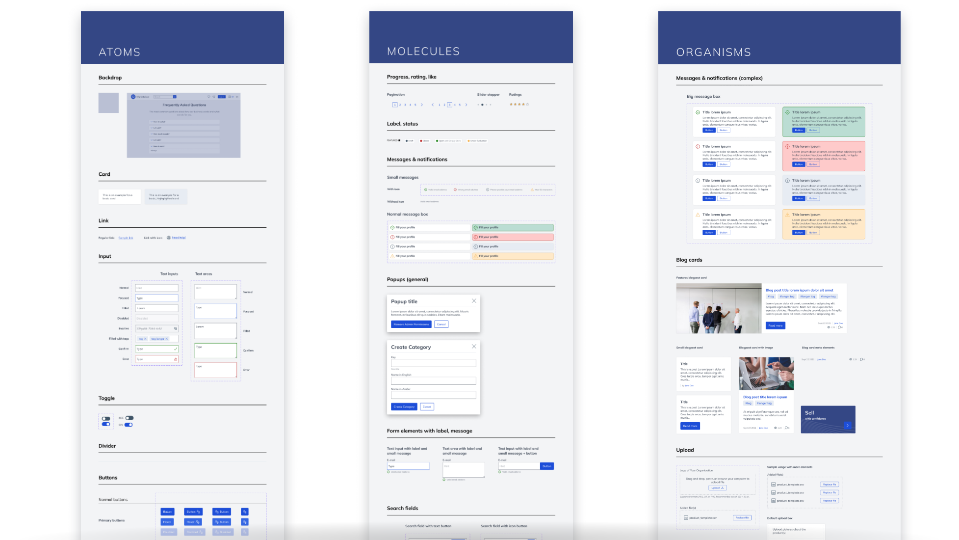
Image: platformOS Component Library
The UX, UI, and Development departments maintain this Library together. It consists of a Figma design file and an equivalent implemented Component Library. So you can decide whether you create a design as a preview first and then implement it when it is finalized, or you use the already implemented components, and jump into coding right away, without any design plans.
Atomic Method
“Atomic Design is a methodology created by Brad Frost seeking to provide direction on building interface design systems more deliberately and with explicit order and hierarchy.”
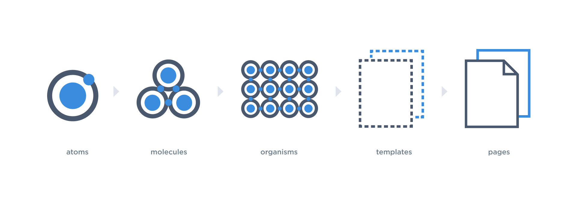
Image: Atomic hierarchy
The platformOS Library was built using the Atomic Design method. The smallest elements — atoms — provide the foundational building blocks and we build the bigger components (molecules, organisms, templates, pages) using them.
As all components in the Library are basically atoms or groups of atoms, using the Library ensures consistency. If you customize the atoms, then the more complex elements that use those atoms as a foundation will get the updates automatically.
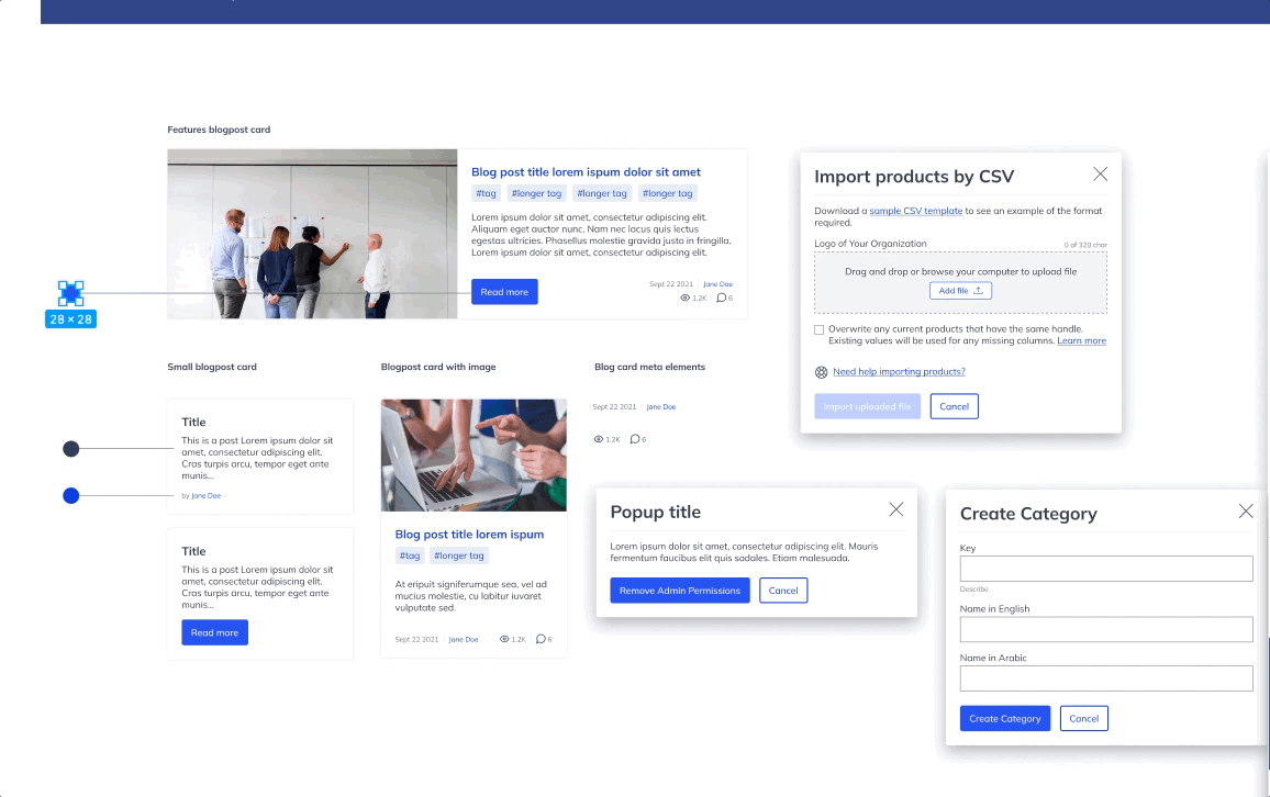
Image: If a main component changes, every instance will be updated automatically thanks to the atomic method.
This makes the work efficient, as you don’t need to do the same changes on every single instance, for example, recolor the buttons in every component, section, or page where they appear.
In the Component Library the elements are organized according to the atomic method being classified as either atoms, molecules or organisms. ‘Atoms’ contain very common UI elements, but as the components become more complex, they would then become classified as ‘molecules’ and ultimately ‘organisms’. Organisms contain more specific, module related components too, such as Ecommerce and Community Group related components.
Advantages
- Speeds up the work
You can build interfaces faster: e.g. module UIs, applications, templates, webpages, etc. - Improves collaboration
UX, UI, and Development team members can all use the same Library components. - Helps onboarding
Newcomers understand the structure of the Library and the usage of styles and elements faster. - Provides standards
The Library as a whole has a unified look and feel, and the elements are used thoughtfully and consistently. - Interfaces consistency
The Library uses the colors, font styles, and functionality of the elements thoughtfully, so the whole design is consistent from both a visual and a functional standpoint. - Easy to customize look and feel
It’s easy to change the designs or apply your branding to the Library. Any changes automatically appear on all interfaces built from the components found in the Library.
The Library also has great design features, which makes working with the Library efficient for UX and UI designers. It is dynamic, flexible, mobile-friendly, accessible, and the components have several swappable variants. You can read more about these design features in our next article.
Provides standards but is customizable
The platformOS Component Library has a basic style without any branding or custom design applied — similar to high-fidelity wireframes. The goal was to create UI building blocks that provide a default but easily customizable look and feel. This default style uses grayscale colors mostly, paired with some additional, prominent functional colors, like the blue interaction color.
Standards
The Component Library has built-in global styles as standards: color styles, text styles, effect styles. Besides the unified look, the components also have functional rules based on common usage patterns. These standards are used thoughtfully with all components. For example, interactive elements (e.g. links, buttons) use the ‘interactive color’ in all of the components consistently. Buttons work the same way and their placement order is consistent. These built-in styles and patterns ensure that you can avoid mistakes and inconsistencies when using the Library.
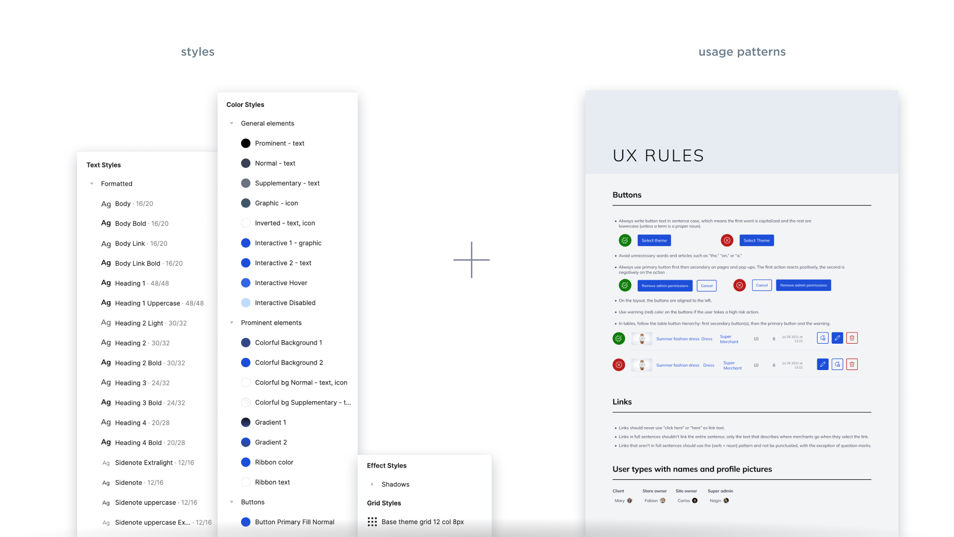
Image: Standards
Customizable
The predefined styles make customization easier. We use them the same way on the different components, but the attributes of the styles can be changed. For example, you can change the colors, font types, and weights as desired. As they are global styles, used all across the Library, any changes will be updated automatically to every instance.
Starting from the default look of the Component Library as a base, you can decide whether you just slightly customize the interfaces built from it to your taste (e.g. change colors, font styles only) or action a high-level customization according to your strict branding guidelines (e.g. change the complete look).
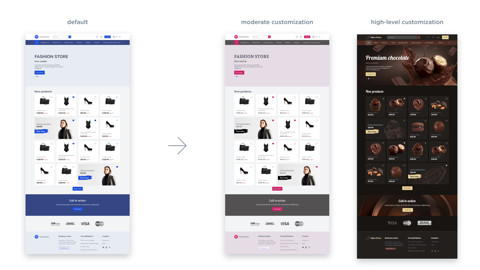
Image: Customization. Look of a landing page built from the default Component Library. Samples for moderate customization (color and font style changes only) and a completely customized look (advanced customization of components besides the styles).
In addition to offering the predefined styles, the Atomic Design method makes this customization easier and quicker.
Usage
The Component Library provides a solid foundation. You can use its components as they are, customize them, or create your own interface ideas, like building
- new module UIs
- new application UIs
- your own page templates
- new (and unique) themes
Next steps
If you would like to read more about how to use the Component Library in Figma, these topics can guide you through the design customization.
- Setting Your Brand Colors in the Component Library
- Setting Your Brand Fonts in the Component Library
- Setting Your Logo in the Component Library
Resources
- Implemented Component Library - in development
Download
Download the latest version of the platformOS DesignKit from our Figma Community profile: