Optimizing SVG Exported from Figma
There are many different image formats that can be used on the web, one of them is SVG. SVG is an XML document describing what should be drawn where and how. You can open an SVG file, read it, understand it, and modify it, if you know the syntax. This is impossible with bitmaps like jpeg or png.
V in SVG stands for Vector and this is why it is exciting. Vectors are math equations that are rendered sharply and accurately no matter what. This means, unlike a bitmap, when you zoom in/stretch it to full screen, it preserves its quality.
Because of those properties, SVGs are often used to present shapes, charts. They are not the best for photos or screenshots, because the number of elements and attributes on those elements would be very high, hence making the file very big.
Problem
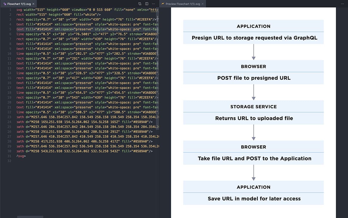
We wanted to have a flowchart that will be light and editable in the future. This is a great candidate for SVG, because lines, rectangles and simple shapes do not take much text to draw in SVG, and the text tag SVG standard allows us to have text that is editable in a code editor, without having a source image or even graphical application.
In this article our objectives are:
- Export a flowchart image as SVG with editable text
- Optimize its size and structure so it's easy to edit
- Try to preserve as much design as it is possible while keeping the file size down
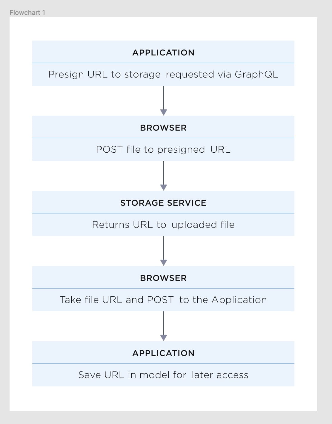
This is what it looks like in Figma:
Solution
Export flowchart from Figma
To avoid exporting text in SVG as paths you need to uncheck "Outline text" in export settings.
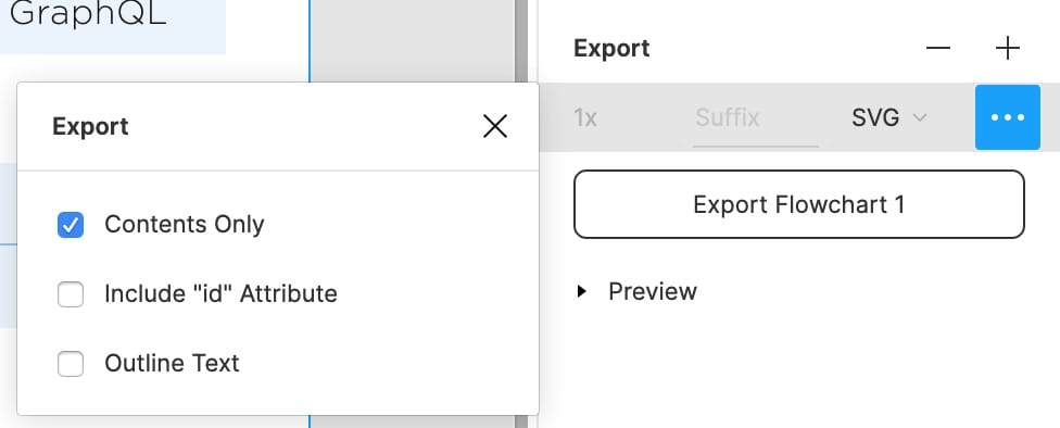
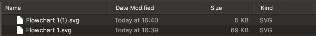
If you were to export it with text outlined, the file would be much bigger. The difference in size would be huge, because text would be traced as paths, instead of written as text tags.
Fix syntax error
For some reason Figma is exporting SVG with syntax error (at least in this case).
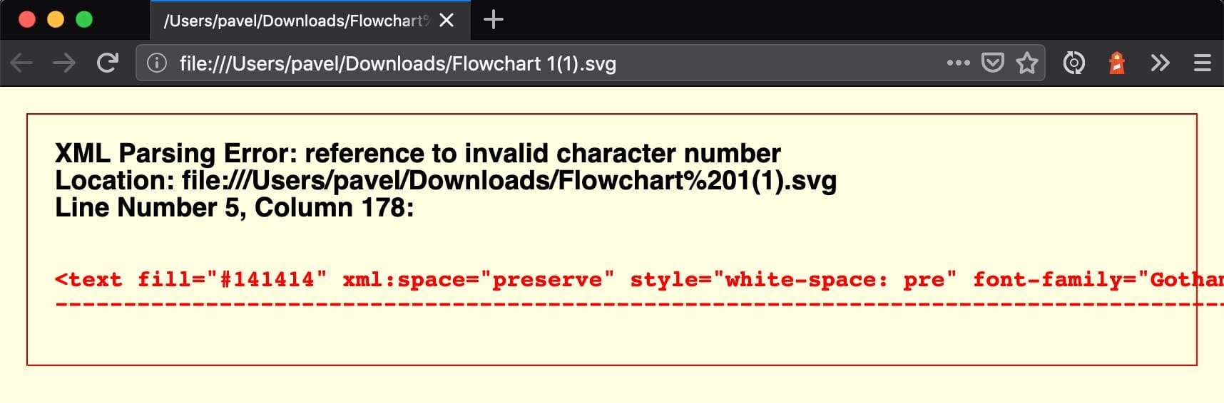
In this case, we needed to replace all  with a space.
From now on, we recommend using Svg Preview for convenience and live feedback.
Custom font issue
Our design is using the Gotham font for text. Because we exported SVG with text as text, not as an outline, the font will be missing and fallback used as a result. For the purpose of this use case, we will replace the Gotham font with sans-serif.
Layers
You should know about one property of SVG before moving elements around in the file. SVG elements can overlap, and if they do, the element that is last in the document will be in front (think of layers, the one on the top on the layers list, is the one on top - in SVG it's the opposite). This is important, because we need to keep our text above blue boxes.
Optimizations
We will use only one technique of optimization to make it smaller and more readable - the g tag, which stands for group.
<g></g> tag groups elements. The elements will inherit properties of the group. For example: font-family, font-size, fill, letter-spacing, stroke.
To know what we can group to make our code more DRY, we look for patterns. It is more of a visual excercise than a programming one. It helps to turn off word-wrap in your editor to recognize those patterns easier. The more of the same attributes are repeated the better because they can be extracted to a group.
Heading text
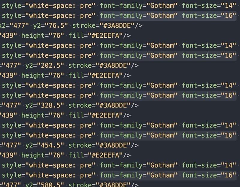
Heading text is the uppercase text in the boxes. When looking at the file and attributes, certain patterns are visible for text tags.
We grouped all those elements inside a group and placed that group at the end of the file, to make sure they will be always visible.
<g>
  <text fill="#141414" xml:space="preserve" style="white-space: pre" font-family="Gotham" font-size="14" letter-spacing="0.5px"><tspan x="205.255" y="64.2">APPLICATION</tspan></text>
  <text fill="#141414" xml:space="preserve" style="white-space: pre" font-family="Gotham" font-size="14" letter-spacing="0.5px"><tspan x="218.313" y="190.2">BROWSER</tspan></text>
  <text fill="#141414" xml:space="preserve" style="white-space: pre" font-family="Gotham" font-size="14" letter-spacing="0.5px"><tspan x="185.429" y="316.2">STORAGE SERVICE</tspan></text>
  <text fill="#141414" xml:space="preserve" style="white-space: pre" font-family="Gotham" font-size="14" letter-spacing="0.5px"><tspan x="218.313" y="442.2">BROWSER</tspan></text>
  <text fill="#141414" xml:space="preserve" style="white-space: pre" font-family="Gotham" font-size="14" letter-spacing="0.5px"><tspan x="205.255" y="568.2">APPLICATION</tspan></text>
</g>
Optimization steps
- We can safely remove
xml:space="preserve" style="white-space: pre"because we will not wrap any lines. - Now let's use
ginheritance feature to DRY it up. - It looks like
tspantags are not needed. We can move coordinates to thetexttag and removetspansaltogether. - Change Gotham font to sans-serif.
- Optional: While we are at it, we can also cut off some decimal places from the
xandyattributes. Be careful when doing this and observe your live preview to not break anything while changing numbers.
After those operations, we get a much smaller and more readable code snippet:
<g fill="#141414" font-family="sans-serif" font-size="14" letter-spacing="0.5px">
  <text x="205" y="64">APPLICATION</text>
  <text x="218" y="190">BROWSER</text>
  <text x="185" y="316">STORAGE SERVICE</text>
  <text x="218" y="442">BROWSER</text>
  <text x="205" y="568">APPLICATION</text>
</g>
Having everything grouped like that makes future changes easier. We can change colors of all headings by changing one attribute.
Description text
There is a lot of text with font-size 16. Optimized description texts:
<g fill="#141414" font-family="sans-serif" font-size="16" letter-spacing="0.3px">
  <text x="64" y="100">Presign URL to storage requested via GraphQL</text>
  <text x="144" y="226">POST file to presigned URL</text>
  <text x="137" y="352">Returns URL to uploaded file</text>
  <text x="83" y="478">Take file URL and POST to the Application</text>
  <text x="114" y="604">Save URL in record for later access</text>
</g>
Blue horizontal lines
Then we tackle the horizontal lines. Grouped lines:
<g opacity="0.5" stroke="#3A8DDE">
  <line x1="38" x2="477" y1="76" y2="76" />
  <line x1="38" x2="477" y1="202" y2="202" />
  <line x1="38" x2="477" y1="328" y2="328" />
  <line x1="38" x2="477" y1="454" y2="454" />
  <line x1="38" x2="477" y1="580" y2="580" />
</g>
Note: We are not extracting x1 and x2 attributes, because it would break the lines.
Blue rectangles
Next up are all the rect (rectangle) tags.
<g opacity="0.7" fill="#E2EEFA">
  <rect x="38" y="39" width="439" height="76"/>
  <rect x="38" y="165" width="439" height="76" />
  <rect x="38" y="291" width="439" height="76" />
  <rect x="38" y="417" width="439" height="76" />
  <rect x="38" y="543" width="439" height="76" />
</g>
Arrows
Arrows are made from two paths. For some reason the fill color of them is different, so we make it consistent by grouping them under one big group.
Grouped arrows:
<g fill="#8589A0">
  <path d="M257.646 158.354C257.842 158.549 258.158 158.549 258.354 158.354L261.536 155.172C261.731 154.976 261.731 154.66 261.536 154.464C261.34 154.269 261.024 154.269 260.828 154.464L258 157.293L255.172 154.464C254.976 154.269 254.66 154.269 254.464 154.464C254.269 154.66 254.269 154.976 254.464 155.172L257.646 158.354ZM257.5 115L257.5 158L258.5 158L258.5 115L257.5 115Z" />
  <path d="M257.646 284.354C257.842 284.549 258.158 284.549 258.354 284.354L261.536 281.172C261.731 280.976 261.731 280.66 261.536 280.464C261.34 280.269 261.024 280.269 260.828 280.464L258 283.293L255.172 280.464C254.976 280.269 254.66 280.269 254.464 280.464C254.269 280.66 254.269 280.976 254.464 281.172L257.646 284.354ZM257.5 241L257.5 284L258.5 284L258.5 241L257.5 241Z" />
  <path d="M257.646 410.354C257.842 410.549 258.158 410.549 258.354 410.354L261.536 407.172C261.731 406.976 261.731 406.66 261.536 406.464C261.34 406.269 261.024 406.269 260.828 406.464L258 409.293L255.172 406.464C254.976 406.269 254.66 406.269 254.464 406.464C254.269 406.66 254.269 406.976 254.464 407.172L257.646 410.354ZM257.5 367L257.5 410L258.5 410L258.5 367L257.5 367Z" />
  <path d="M257.646 536.354C257.842 536.549 258.158 536.549 258.354 536.354L261.536 533.172C261.731 532.976 261.731 532.66 261.536 532.464C261.34 532.269 261.024 532.269 260.828 532.464L258 535.293L255.172 532.464C254.976 532.269 254.66 532.269 254.464 532.464C254.269 532.66 254.269 532.976 254.464 533.172L257.646 536.354ZM257.5 493L257.5 536L258.5 536L258.5 493L257.5 493Z" />

  <path d="M258 165L251.938 154.5L264.062 154.5L258 165Z" />
  <path d="M258 291L251.938 280.5L264.062 280.5L258 291Z" />
  <path d="M258 417L251.938 406.5L264.062 406.5L258 417Z" />
  <path d="M258 543L251.938 532.5L264.062 532.5L258 543Z" />
</g>
Note: If you want to experiment, as an excercise, you can also cut off decimal places from the d attributes of paths. This will make the file size even smaller and in this case has no visible effect. Look at the source of the final image at the end of this article to examine the result.
Font weight
Now that we have flowchart elements grouped and cleaned up, we need to tackle one visual regression that we have been ignoring thus far.
Because we changed font-family to sans-serif, we need to set font-weight. Heading text needs to be bold, bottom text needs to be lighter.
<g font-size="14" letter-spacing=".5px" fill="#141414" font-family="sans-serif" font-weight="bold">
<g font-size="16" letter-spacing=".3px" fill="#141414" font-family="sans-serif" font-weight="lighter">
Finishing touches
Finally, we remove the height and width properties from the SVG declaration, so it will take as much space as we want when we use it in our HTML.
<svg viewBox="0 0 515 660" fill="none" xmlns="http://www.w3.org/2000/svg">
Also, because Gotham font has a different width than sans-serif, we adjust the x attribute for description texts, to be centered in regards to arrows.
Results
After all those optimizations, we have an SVG file that is 2.5 KB (with no minification, no gzip), easy to edit, and looks like this:

In fact, what you are looking at, is the final file we used in our documentation. It is very crisp, no matter the resolution and pixel density, which is why we love SVG.
We think it was a good time investment and shows respect for people using (often expensive) mobile internet.
You can examine the results of the optimizations in the form of two different SVG images in our User Uploads in platformOS article.